
The site I chose was my favorite restaurant back home(<3): Lanzhou Ramen. (See original restaurant site here).But unfortunately, unlike their noodles, the design of their site is not the greatest. So I decided to give it a make-over!

Current Homepage
In response, they stated that they had hopes for the website to serve 3 main functions:
→ Create a brand for the restaurant, instead of just being a storefront in a plaza strip
→ Make ordering/making reservations online easy
→ Demonstrate the intricate noodle-making process and the history of the food that is served
Currently, they are not seeing as much site traffic as they would like to and have only received a handful of online orders and reservations from their website.
I began by using the WebAIM WAVE tool to find out the accessibility issues the site may have.
A few issues that I found were the low-contrast visuals as well as some redundancy issues that the tool pointed out.
After conducting user research, I found that there were numerous usability, learnability, and memorability issues with the site that undermined the quality of users’ experiences and hindered their actions to checkout.
In general, there are many visual design and usability issues with the site. The most troublesome one is the fact that the layout of the site looks cluttered and unorganized, and because the order section is saturated with visual noise, they are losing customers since users do not know how to navigate the site and are not responsive to the unclear call to action.

One thing I had to keep in mind when designing is that I have to work within the limitations of my own front-end development skills. Thus, the goal of the redesign became: How can I solve those usability, learnability, and memorability issues in the most straightforward way possible?

So, how did I get here?
To address the problems users had the with the original site, below are some key solution points...
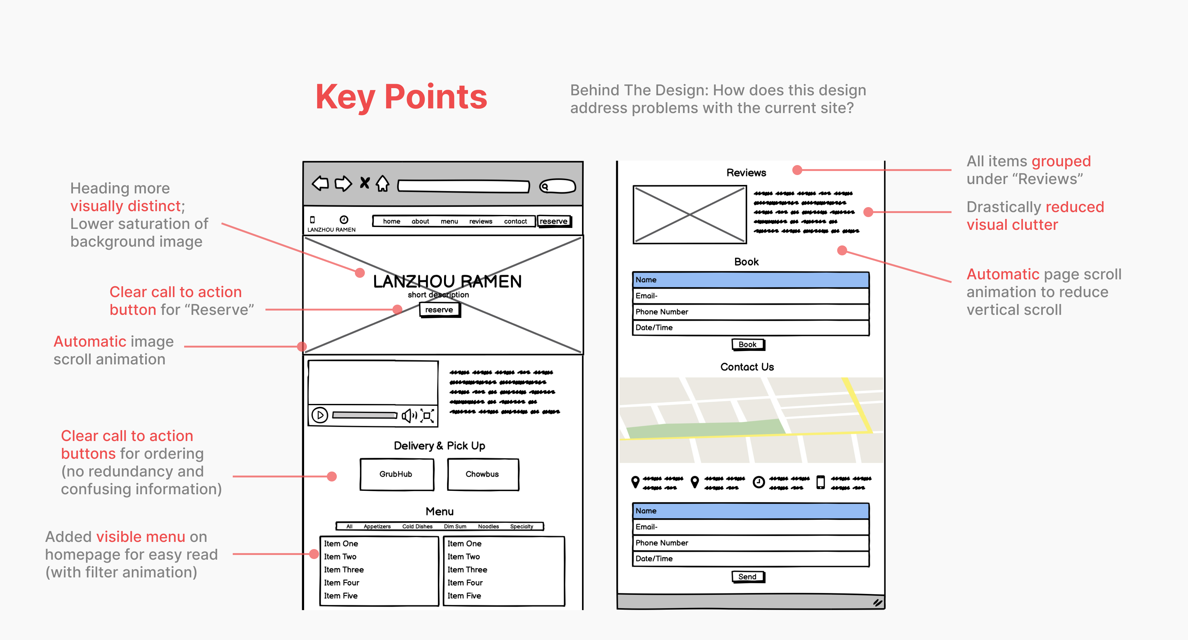
Following the restaurant’s theme of bold, authentic flavors, I went with bold and more traditional Chinese colors such as red and golden orange for the main color palette.


Based on previous user research, users find the ordering process much easier when there are clear call to action buttons and easy access to the menu. So, the redesigned homepage contains clear and distinct sections for ordering and making reservations as well as a visible and filterable menu.
We also have to make sure that the homepage is visually appealing across desktop, tablets, and mobiles for all users...

To make sure the large screen fits mobile devices, I made a hamburger menu for the navigation bar, vertically aligned the call to action buttons, and restructured the contact section.

I used carousel container element for the few animated scroll pages present in the homepage (as seen above) and used a grid system for aligning all the div elements.
See the complete code for the site →


Through this project, I learned a lot about the nuances of front-end development as well as the limitations it can set for visual designs. For instance, originally, I had wanted to work with some overlay elements in my designs to make the homepage more eye-catching and interactive. However, after trying various ways to implement the overlay features, I couldn’t figure out a method that would make it look and move the way I wanted it to so I resorted to more static designs.
Ultimately, I enjoyed working in HTML and CSS to translate a vision from Figma designs to an actual functioning (+ responsive!) site.
Next Steps:
After creating and building the homepage, I reached out to the owners of Lanzhou Ramen with my designs and they were ecstatic to see the transformations! I will be communicating with them further to implement more changes and hopefully make it fully functional and put it to use one day!


