...I get home from school, toss my bag onto the bed, and, wanting to know what hits everyone is listening to right now, I swipe through my home screen and tap on Pandora, sitting right between Instagram, Snapchat, and Vine (R.I.P.). Sugar by Maroon 5 starts playing.
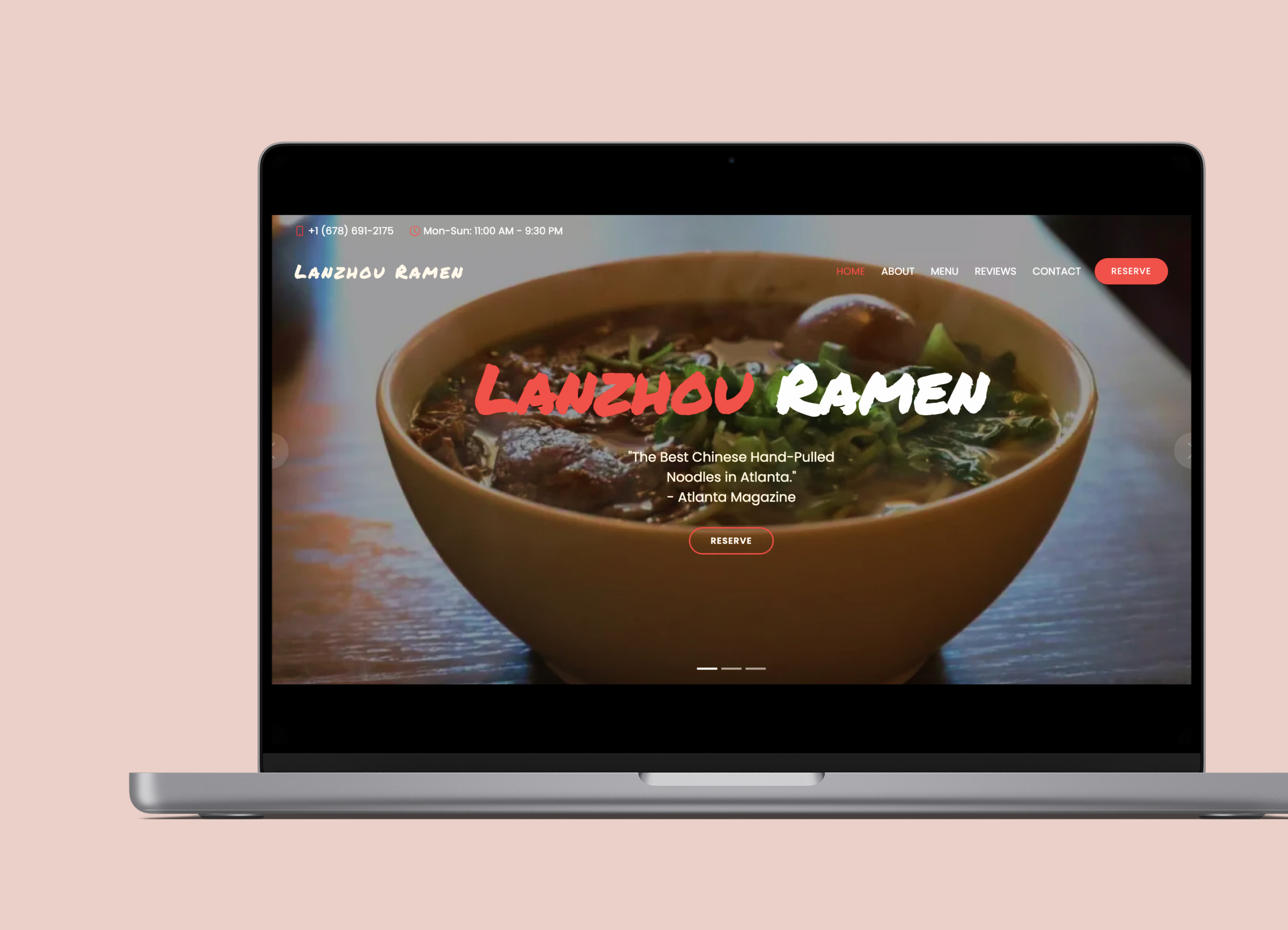
All throughout my teenage years, Pandora Music had well maintained its spot as one of the big 4s of my daily app rotation. Jumping back to the present, in the year 2023, as I swipe through my recently used apps, Pandora is nowhere to be found. What has changed?
After rummaging through the Pandora mobile app’s interface and functionality, I found that perhaps a better question to ask is, what hasn’t changed?
However, in a world where its top competitors Spotify and Apple Music are utilizing attractive interactions and eye-catching designs, and user interface and experience are the MVPs of customer retention,
Pandora is long overdue for a facelift.
While Pandora's interfact has remained the same in the past few years, its biggest competitors such as Spotify, Apple Music, and Amazon Music have been consistently updating their interfaces, utilizing sleek designs, and engaging interactions to capture their user’s attention.
I conducted 3 interviews with users who have used Pandora Music mobile app to understand their frustration as well as their satisfactions with the app. I also read through numerous Pandora community forums to gauge a wider reception of the app interface. Here is what I found:

Some of the shared headaches are rooted in the fact that users do not find the interface to be visually engaging and organized. Some said described the interface as "not sleek". Because of this, they don't feel attached to the product as there is a lack of emotional connection with the interface.
Consequently, they also do not feel compelled to become consistent users.
I found that there were some general issues with visual hierarchy, structure inconsistencies, and spacing issues that is making it look cluttered to the user.


Note: Particular design choices made here:
One of the visual changes I made throughout the interface was rounding the edges of components and logos to give the interface a more friendly and approachable look overall.
My reasoning for this came from an article that discusses the power of rounded edges.(read here)
TLDR: Rounded edges tend to make the interface seem more approachable and trustworthy.

I also created a dark mode version in order to increase user engagement with the interface since dark mode is more effective at reducing the eye strain and fatigue that comes from staring at a bright screen for an extended amount of time.
*Note: the rest of the redesigns will be shown in the dark mode version*
I found that the biggest issues were with the fact that there is a lot of negative space that do not feel purposeful, making the page feel sterile, static, and unengaging.


I also added interaction animation to make the Now Playing page feel bouncier and more alive.
In addition, I made changes to the up arrow icon and the page it pulls up since the arrow icon alone is not descriptive of its function and the pull-up page lacks visual hierarchy and feels cluttered with large amounts of text.
It is now more explicit what other functionalities are available on the page and the details page is cleaner, organized by similar elements, and more readable.
Based on previous user research, one of the aspects users liked the most about Pandora is the ability for them to passively discover music while maintaining the sense of personalization that comes from being able to create your own stations.
Then, naturally, the Collections page carries a significant responsibility in making sure users feel compelled to use the feature consistently.
However, the current Collections page...

Sooo, how can I make the page feel more alive and interactive?
To come up with a solution, I took inspiration from my personal love for
1. browsing through vinyl records
2. designs that mimic real-life actions
and created a layout that feels new and fresh with the vertical scrolling action which resembles a user looking through physical vinyl records. Without further ado...


This design is a bigger visual leap that I made and it condenses the list form layout into a few simple elements to make it easier and more intuitive to navigate.
I divided the stacks into their respective categories: "Created (by user)", "Recent", and "For Me". Previously, these stacks did not feel very distinct, had overlapping names, and there was no option for users to only see the stations they created. Allowing users to filter by these categories make the experience feel more personalized.
By making the Collections stack look like real life CD stacks, it creates a more emotionally engaging interaction when users are browsing through their collections and encourages user loyalty and memorability.
The bouncy animations also make it more satisfying for users to swipe through their stations.
(also it’s just more fun! :D)

I also redesigned the collection details page.
The layout is now more condensed and all the information is visible at first glance.
Switching out the list layout of information also lessens “scrolling fatigue” [when a user becomes frustrated with scrolling and leaves the page without digesting its important points].
This was one of the first mobile designs I have worked on and I had a lot to learn about design principles and visual hierarchy from dissecting the previous Pandora UI (role-playing as someone with any credentials to do so).
Ultimately, one of the most important lessons in trying to create a design with the goal of increasing user activity and encouraging user retention is to recognize what users value the most about the brand/application and make sure the designs align with those values.
I also learned that one must always design with user-endgoals in mind and strive to create a design that is visually clean, engaging, and intuitive.